Thursday, March 13, 2014

The reveal

 Those of you who have been following the last few posts about my new project will remember that the objective was to tone down the corner accents of hand dyed fabric.  Above is the original layout (not stitched).
And here is layout #2 - slightly different angle, sorry - but you can see what a difference the screen printing has made to the way the quilt looks.  I am much happier with it now.   I did not attempt to reproduce the original layout - I just started from scratch and tried to ensure that there was a pattern with the corners, and that no 2 pieces were the same where they adjoin.
The dogs are, of course, completely familiar with this sort of thing and don't mess it up :-).

I welcome your comments!  Please tell me which version you prefer, and why.

Tuesday, March 11, 2014

A new project! Part 4

 One thing I've learned with screen printing is that paints don't behave like dyes.  Mix red, blue and yellow dyes, and you get brown.  Mix these as paints, and you get dark grey.  Not what I wanted.  I have had some comments about my approach to colour mixing :-) ...sometimes you have just to do it.  There are no exact recipes for this.
 Plan B was to make an orangey colour. At least red and yellow worked here.
 The design I made for the black triangles was a simple stylized sun.

 This was quick and easy to do.
 For the navy triangles, I did a far more difficult design.  This involved printing most of the triangle, so it was pretty tricky to line up.
 It didn't always work perfectly, and I had to touch up some triangles with a cotton bud, adding paint to areas that were missed.
To avoid getting paint on the rest of the block, I used a piece of waste fabric as a shield.
 Here's the results - the black with gold suns above...
..and the overprinted navy triangles below.  

I will probably leave the grey triangles as they are.  Next step is to lay all the blocks out on the floor, and see how they look.

Friday, March 07, 2014

A new project! (part 3)

For the Rust Orange triangles, I decided on a quite different design.  It started out to be leaves but it looks more trees.  I find it helps to not overthink your designs.   I started by drawing the shapes, but when I began to cut, they came out differently.

Here's the design on Contact paper on the screen.

 I had grey paint left over, but wanted it to look a little different, so I added black and red....
 ..and some yellow...

 and a bit of blue.  Because I love colour, it does not matter to me if the paint in completely mixed or not.
And here is the first print.  Again, perfection is not required - it is the overall look I'm aiming for.  Once the paint is dry and ironed, I'll post a group shot of the triangles, and then start on the Navy bits.

Wednesday, March 05, 2014

A new project! (Part 2)

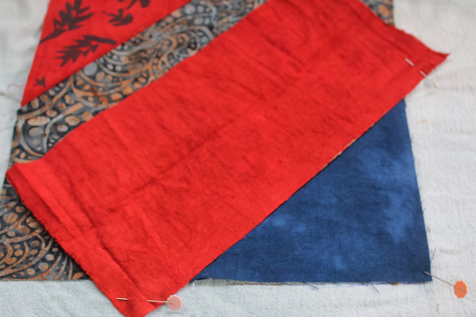
I pondered for a while about how I could improve the look of my blocks.  One option was to unpick all the fabric I wasn't happy with, and replace it with a different, more muted colour.  However, I hit upon a solution that meant I didn't have to go to all that trouble.

I really like how the quilt that inspired me was made with all patterned fabric - not something I usually do.  Also, I have fabric paint for screen printing, so decided that I would screen print designs onto the fabric triangles  I wasn't happy with in order to tone them down.  Here's what I did:

Firstly, I taped up my screen so that the visible part was the same size as the fabric triangles. I am going to work on the Butterscotch triangles first.
 Then I mixed black and white fabric paint.  I wasn't too worried about it mixing perfectly.
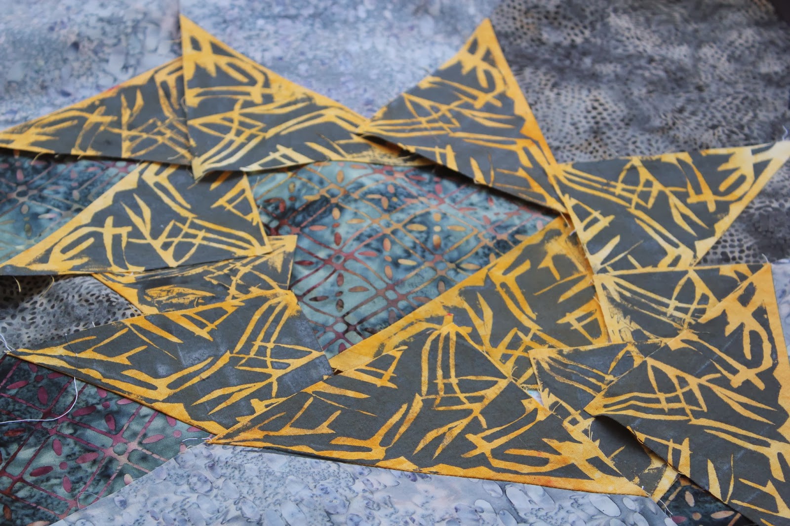
Then, I cut little bits of Contact paper into shapes and stuck them on the screen.  Other colours will have other designs.  This design only has to screen print the 12 Butterscotch triangles.
 Here's the sample I did.  Too much paint, but apart from that, I was happy with it.  However, my first attempt on an actual block wasn't successful.  It was very hard to see through the screen to line it up properly and I ended up with paint all over the edge of the batik fabric.  I had to wash it all off.  This was a case for registration marks!

I measured how far my screen triangle was from the edges of the screen, and marked that.  I also marked the outline of where the screen would sit. I tested this again before using a block, and it worked fine.  The fabric was fastened to the background with flat quilting pins.

 Here's my first attempt.  I am not concerned about irregularities or smudging - batiks, by their nature, often do not have precise patterns.
And here are the 12 printed pieces.  I'll use different colours and designs for the Rust Orange triangles and probably also the Navy.  Photos to come of these later.

A new project! (Part 1)

I have been putting off making new quilts for a variety of reasons that I won't bore you with.  I have now got my head in a better space, and decided to try a grey quilt.  I found some lovely batiks :
 and then I hand dyed some fabric that matched with the colours in the batiks.
This is the design I decided on - I wanted something simple, where the beauty and colour of the fabrics could be displayed (and it didn't take me long to sew)
 I had no pattern, so worked out the sizes to best fit the fat quarters.  I decided to sew the blocks the easy way - with a square in the corner.  I also sewed another seam 1/2" in from the diagonal.
 Then I cut between the 2 lines of stitching...
 ..to produce one large block and one small block of half square triangles.  I will use these on the back.
 When I'd sewn all the blocks, I laid them out on the floor.  Hmmm. I wasn't totally happy with the result.  I felt the contrasting fabrics I'd added were too bright.  Way too bright.  What to do?  See part 2.